The new application form brought in +$500K in 2025
Cut the microloan application form from 8 minutes to 2: the user just snaps their passport and a selfie, and gets a loan of up to $500.
Context
Alfa-Money — microloans up to $500 on your card in 5 minutes. There were two steps: first the user filled in their name and contacts, then passport details by hand.
What problems I found
Goals
Cut form filling from 8 to ~3 minutes. Cut passport-block drop-off from 35% to <20%. Lift take rate from 7% to 10%+.
Discovery
I wired up per-screen analytics in Amplitude and saw it: nearly 80% of the drop-off at the passport block lands on the passport series and number fields. Interviews with people who abandoned the application surfaced two reasons: typing passport data on a phone is slow and typo-prone, and some people simply didn't have their passport on hand at the moment of applying.
An MFO customer shows up in a moment of urgent need: they need the money today, the clock is ticking. In that context a passport photo reads as a fair trade — faster than recalling and typing out 10 fields. The urgency of the task outweighs the discomfort of photographing a document — the interviews confirmed it.
User flow
Turns out the "marital status" and "education" fields weren't adding any accuracy — their effect on default prediction was statistically insignificant. That, plus what users told me in interviews, led me to remove them.
The passport photo and selfie cover not just filling out the form but also KYC (know your customer — the mandatory client identification). I built the biometrics-processing consent into the data-review step — legal wanted a separate screen, but I settled on a checkbox with expandable text so I wouldn't add an extra step.
Fills in name, last name and contacts
Types passport details manually
Fills in personal data
Gets approval or rejection
Snaps passport, address and a selfie
Reviews recognized data and ticks the consent boxes
Gets approval or rejection
Hypotheses
If I remove manual entry of passport fields and replace it with a photo — conversion to submission will grow
Variant B won. Submission CR:
37% → 55% (+18 pp)
If I tell the user what's happening during scoring — they won't close the tab
Drop-off at scoring:
30% → 18% (−12 pp)
If I add a button that opens the app and an animated visual for the approved amount — take rate will grow by 5–10 pp
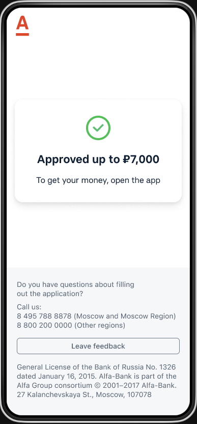
Take rate grew by
+ 8 pp
If I submit the application right after recognition, skipping the review step — I'll cut an extra screen and lift conversion
Conversion didn't grow, and dipped in places: people don't trust auto-fill and want to confirm the data was recognized correctly before submitting.
If I start with the selfie — low barrier, just a face — the entry feels softer and first-step conversion goes up
The opposite: a selfie up front scared people off — it wasn't clear why the bank needed their face before any application context. No statistically significant lift.
Errors and edge cases
The user sees the recognized data on the review screen: they can double-check it and edit any field before submitting.
Hints right in the camera: “move closer,” “too dark.” The flashlight turns on automatically in low light.
I give 5 photo attempts. If it still doesn't work — I switch to manual entry.
Rejected ideas
Not everything I discussed made it into the MVP. Some ideas I rejected outright, some I parked in the backlog — here are the most telling ones.
It opens a fraud hole — someone could submit a stranger's passport found online. With an in-app camera, I know the photo was taken here and now.
More expensive to integrate, slower for the user. The level of protection is comparable to a liveness photo.
Post-analysis and takeaways
After release I collected metrics for 2 months. An A/B test: 50% of traffic on the new flow, 50% on the old form. The test group clearly beat the control, and the flow was rolled out to 100%.
Measured as an increment: (new take rate − old) × average loan size × 2025 application volume, based on the A/B test.
What I learned along the way
- 1.It matters to give users a choice — fill via passport or by hand. There are cases when the passport isn't nearby but the person remembers the details; without the alternative, that user just drops off. This is going into the Q2 2026 follow-up.